
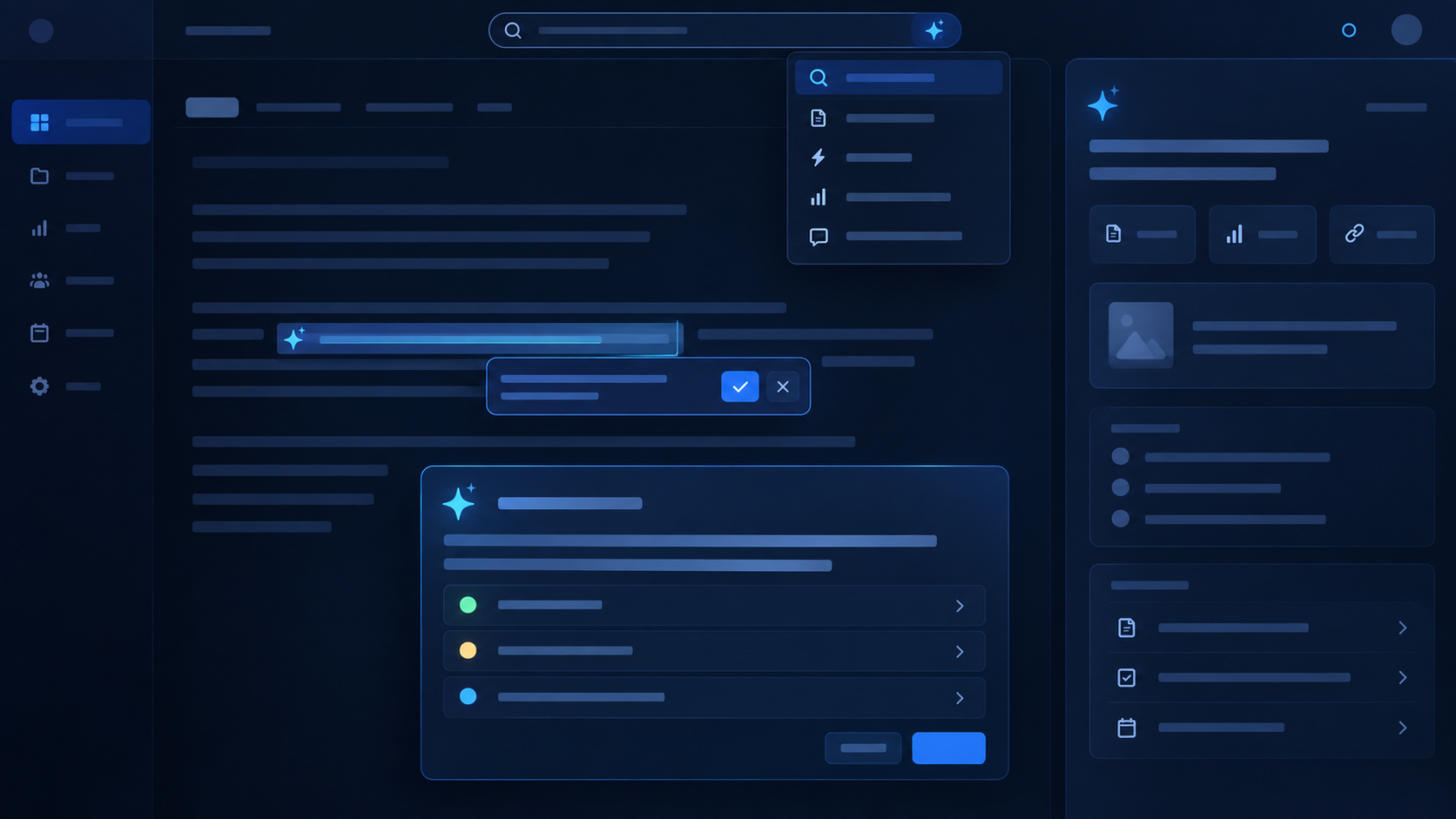
Improve AI feature UX with 6 essential SaaS interface patterns, including inline suggestions, review cards, smart search, contextual panels and bounded actions. This guide explains the decisions, implementation boundaries and review points that matter inside an established product.
Table of Contents
AI feature UX: a practical overview
Why Chat Is Not Always the Right Interface for an AI Feature is a practical question for established B2B SaaS teams that already have customers, workflows, APIs, data and permission rules. The useful answer is not a list of model capabilities. It is a way to improve a real product task while keeping the surrounding software understandable, secure and supportable. This guide focuses on the decisions a product and engineering team can make before the feature reaches customers.
Chat is familiar, but familiarity is not product fit
A blank text box is easy to demo, but it can add friction when the product already knows the user task. Existing SaaS screens already contain record, workflow and permission context. Users should not have to restate information the product already knows. The important point is that the decision has to make sense inside the normal product workflow, not only in a demo. The team should be able to explain who benefits, what changes for that user and which existing product boundary remains in control.
Choose the interface that removes work from the current task. Treat chat as one option rather than the default. For a mature SaaS product, this affects the API boundary, test cases, support path and what the user sees when something goes wrong. Making that choice explicit early reduces rework and gives product and engineering a shared standard for the first release. A generated field beside an editor may be more useful than asking the user to open a conversation. A simple way to check this is to ask the behavior can be reproduced with representative product data and a real permission context.
Use inline AI when the task is obvious
Inline suggestions work well when the product knows exactly what the user is trying to produce. Generate a draft in the field where it is needed. Make accept, edit and reject actions simple. This matters because the decision has to make sense inside the normal product workflow, not only in a demo.
Measure acceptance and edit rate. Keep the AI responsibility narrow and visible. In an established product, this affects the API boundary, test cases, support path and what the user sees when something goes wrong. Reply drafting, description generation and summary fields often fit this pattern. The practical check is the behavior can be reproduced with representative product data and a real permission context.
Use review cards for extraction and recommendations
Review cards are strong when AI proposes structured information or a decision. Show the proposed value and evidence together. Make confidence or review state clear. The reason is straightforward: the decision has to make sense inside the normal product workflow, not only in a demo.
Support confirm, edit or reject actions. Keep product state unchanged until policy allows the result. Inside an existing SaaS product, this affects the API boundary, test cases, support path and what the user sees when something goes wrong. This pattern fits document extraction, risk flags and data-cleanup recommendations. A useful test is to ask the behavior can be reproduced with representative product data and a real permission context.
Use AI search when the user is looking for information
If the primary problem is discovery, improve the search experience instead of forcing conversation. Interpret natural-language intent. Apply permission-aware filters and retrieval. That sounds simple, but the decision has to make sense inside the normal product workflow, not only in a demo.
Show sources and matching records. Provide concise answer cards where useful. For teams with real customers and production data, this affects the API boundary, test cases, support path and what the user sees when something goes wrong. Search keeps the mental model familiar: ask for information and inspect the results. Before moving on, check whether the behavior can be reproduced with representative product data and a real permission context.
Use command patterns when the user knows the action
A command bar can combine natural language with a bounded action vocabulary. Interpret flexible details around a known action. Show a preview before meaningful state changes.
Avoid keeping a permanent conversation when none is needed. Make supported actions discoverable. “Create follow-up task next Tuesday” can be a command without becoming a full assistant session.
Use chat when conversation actually helps
Conversation is useful when the user needs to explore, refine and ask follow-up questions. Use it for ambiguous investigation or analysis. Provide verified product context behind the conversation.
Offer contextual starters rather than an empty box. Keep the scope tied to the current product area. Support investigation and exploratory analytics may genuinely benefit from several turns.
Avoid the blank-box problem
An empty chat asks the user to invent the product interaction. New users may not know what is supported. Experienced users may ask for actions the feature cannot perform.
Suggested prompts should reflect the current screen or workflow. Frequent tasks are better exposed as direct controls. On an account page, suggested questions can focus on risk, open issues and recent changes.
Design around interruption cost
AI should reduce context switching, not create a new place to move work. Measure the time to complete the full task. Avoid copy-paste between chat and the system of record.
Keep frequent AI output close to the data it affects. Use asynchronous patterns when waiting would interrupt the user. A fast model answer can still create a slow workflow if the user has to move it manually into the product.
Make AI state visible
Users should know when content is generated and when it becomes saved product state. Distinguish suggestions from committed changes. Show processing status for background work.
Show confirmation when actions have consequence. Provide source links when factual support matters. Clear state helps the feature feel predictable rather than magical.
A practical example
A support reply feature may need very little chat. Prepare a short case summary automatically when the agent opens the case. Place a suggested reply above the existing editor.
Provide source links for important account facts. Keep a small contextual question panel only for deeper investigation. Most cases can stay inside the normal workflow without a conversation at all.
How to choose the interface
Match interaction to task structure, frequency and consequence. Structured tasks favor inline controls and review cards. Exploratory tasks favor search or conversation.
Frequent tasks deserve a fast direct path. State-changing outputs need explicit controls. Test with people who already perform the workflow; they know where a new conversational step becomes annoying.
Do not make AI the entire product navigation
Natural language can shorten navigation without replacing product structure customers rely on. Keep predictable screens for review, audit and bulk work. Use AI as an additional path, not the only path.
Expose important state visually. Preserve normal workflows when the AI path is unavailable. A mature SaaS product still needs clear controls even when natural-language shortcuts are available.
AI feature UX: frequently asked questions
When is chat the right AI interface?
When users need iterative exploration, follow-up questions or a flexible way to work across uncertain information.
Can one feature use several AI interface patterns?
Yes. A product can use inline suggestions, AI search and a contextual chat panel for different parts of the same workflow.
How should we measure AI feature UX?
Measure task completion, time, acceptance or correction rates, abandonment and repeat use rather than chat volume alone.
AI feature UX: final takeaway
Why Chat Is Not Always the Right Interface for an AI Feature becomes much easier to plan when the team keeps one real user workflow at the centre of the design. Use the existing product boundaries, make quality measurable and keep the first release narrow enough to understand end to end. That is a more dependable route to production than adding a broad assistant and hoping customers discover the value on their own.
Machine Minds works with established B2B SaaS teams on this kind of bounded AI feature development: shaping the workflow, integrating with real product context, building evaluation and taking the capability through a controlled release. The next step should be based on the evidence from that first feature, not on a generic AI roadmap.
AI feature: further reading and next steps
For a complementary approach to trustworthy AI design, evaluation and ongoing oversight, explore the NIST AI Risk Management Framework. Apply those principles alongside your product’s existing authorization, testing and release controls.
Explore Machine Minds AI Product Engineering and the AI Feature Sprint, or discuss your product workflow with the team.
When planning AI feature, keep the scope tied to one measurable customer task. Review AI feature with engineering and support before expanding the release.
